Brand Guidelines
One Eighty Degrees is the parent brand leading innovation in immersive technology. Our mission is to reshape how people experience real-time events through cutting-edge immersive media and storytelling. From engineering to design, everything we build serves the goal of immersion.
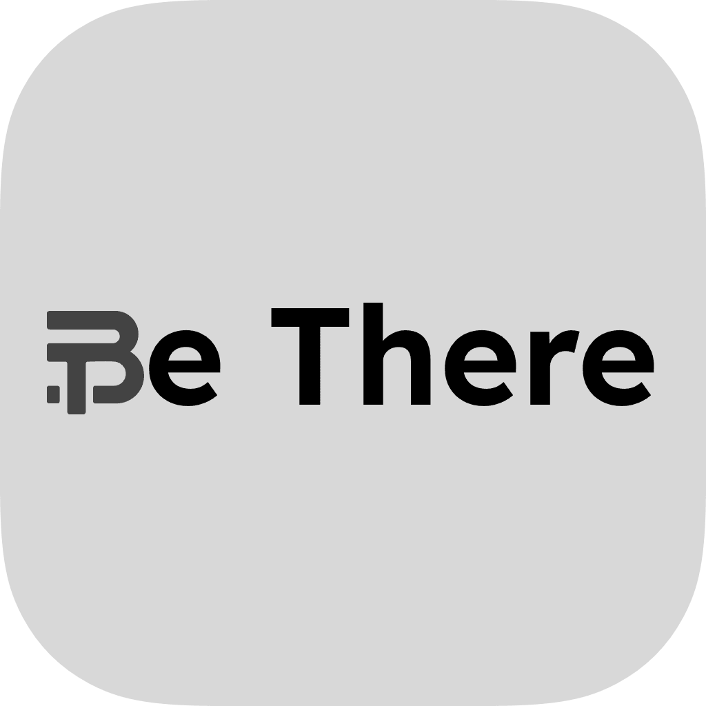
Be There is our flagship platform; bringing live events to life in 180° immersive video for spatial computing devices. It places fans inside the stadium, courtside, or pitchside with unprecedented presence and clarity.
These guidelines ensure our brand is presented clearly and consistently across every external touchpoint: whether by press, partner clubs, leagues, or event organisers. Whether you’re featuring us in a broadcast, publishing content, or integrating our logo into promotional material, this documentation outlines exactly how to represent Be There and One Eighty Degrees correctly.
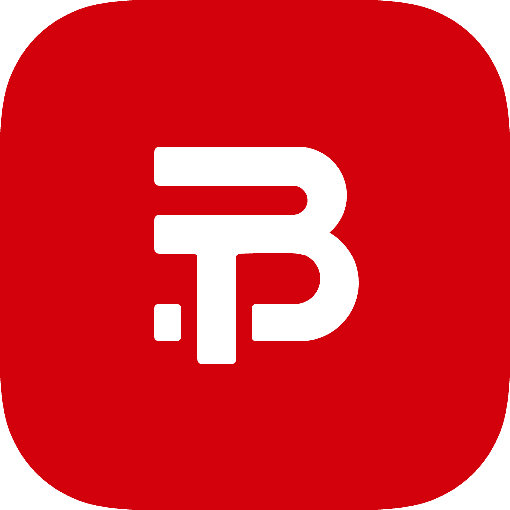
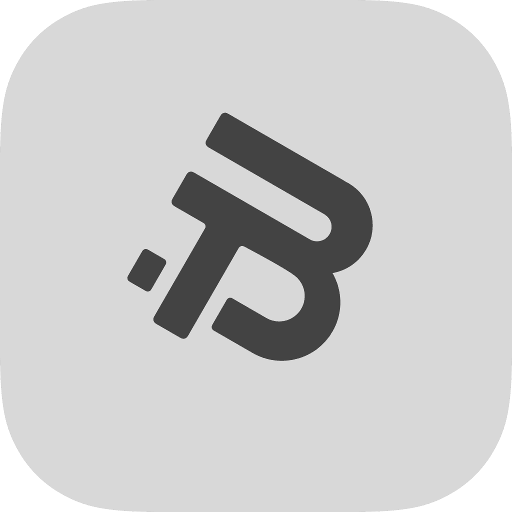
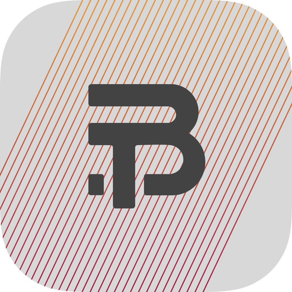
The Be There logo is designed to be flexible and club-aware. It adapts to the color identity of the football club or league it appears alongside. This makes it feel native to each team’s ecosystem while remaining recognisably ours.
Examples


Usage Guidelines
The logo should adopt the primary and/or secondary colour of the featured club or competition.
When adapting the logo colour, ensure sufficient contrast for legibility.
Logo Misuse
The logo should not be distorted, rotated, or stylised with shadows, outlines, or effects.


The One Eighty Degrees logo is minimal, stable, and intentionally restrained. It is designed for high-contrast technical and corporate use.
Usage Guidelines
On dark backgrounds, use the white version of the logo.
On light backgrounds, use the black version of the logo.
Backgrounds should be solid colours with minimal noise or texture.
Avoid placing the logo over gradients, images, or visually complex surfaces.
Do not recolor, distort, or apply effects like shadows, glows, or outlines.